Case study · 2018 to 2022 · Under NDA

Real-time drilling data, redesigned for remote surveillance.

When Covid-19 made remote surveillance business-critical, the web product was not ready for it. Over four years I led UX research, the redesign, and a design system spanning the desktop real-time monitoring app and its field mobile companion.

The case walkthrough: real-time monitoring redesign across desktop and the field companion. Turn the sound on.
DomainOil & gas, real-time monitoring
Years2018 to 2022
My roleSenior UX Architect & Lead Designer
ProductsDesktop monitoring app, field mobile app, design system
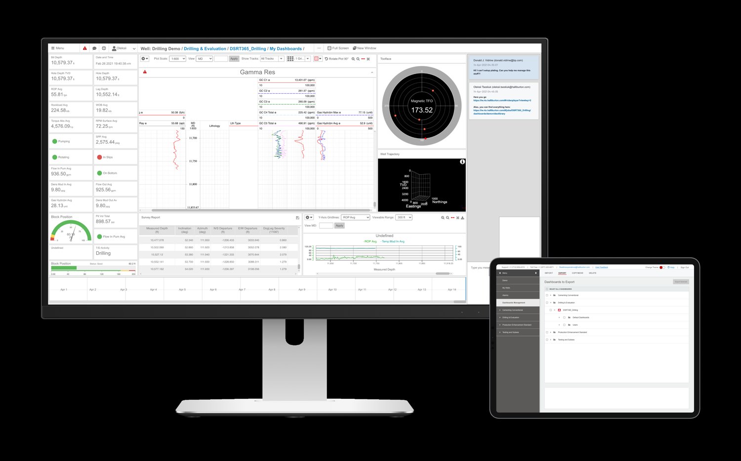
Real-time drilling dashboard on a monitor with the tablet companion
The drilling dashboard on a monitor with dashboard management on the tablet companion. Identifying details are blurred.
Problem

A business-critical tool that did not support how people now worked.

For the business
  • The web product became business-critical during Covid-19, but the UI and UX did not support remote surveillance
  • The company did not know what to improve to retain and win customers
For the users
  • The screen distracted attention: too many controls
  • Users were unaware of new features and updates after each release
  • The support team had to explain data management over the phone
Solution

Less on screen, more in context.

A UX audit and stakeholder and user interviews defined the direction. We shipped a full screen mode that removes controls when engineers monitor live data, integrated chat into the home screen for in-product communication, and created a tutorials page with shareable feature walkthroughs so releases explain themselves.

A brand style and design system covers the drilling, well, production, information management and investment domains, across desktop and the field mobile app.

MethodsUX audit · stakeholder interviews · user interviews · information architecture · design system · multi-platform · demo videos
Process

System analysis first: the whole product mapped before redesign.

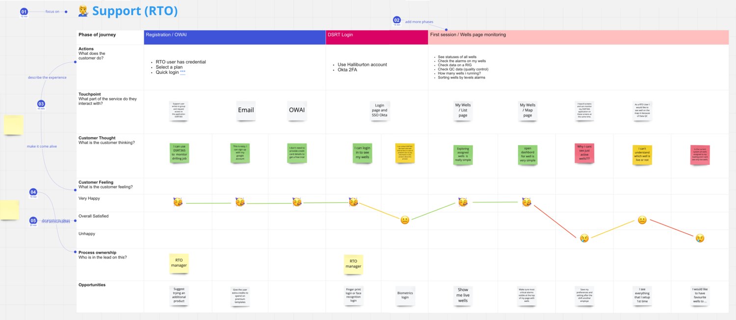
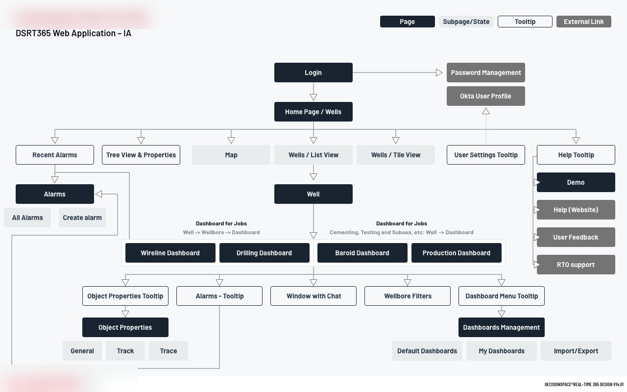
Over four years the program ran on evidence, not taste: a UX audit, a user survey with cluster analysis of the responses, a customer journey map of the support flow, and an information architecture diagram of the entire web application. Each redesign decision traced back to one of them.

Customer journey map with emotion curve, touchpoints and process stages
The customer journey map of the remote-support flow: touchpoints, process stages, and the emotion curve that showed exactly where engineers struggled.
Information architecture diagram of the entire web application
The information architecture of the whole web application: pages, subpages, tooltips and external links in one diagram. The map the redesign was planned on.
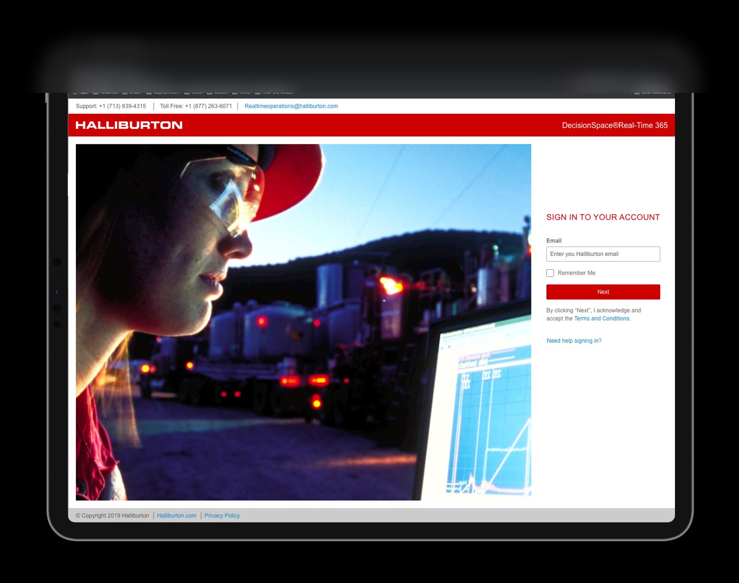
Tablet sign-in screen for the field companion app
The field companion on a tablet: the same design system, in the conditions it was designed for. Identifying details are blurred.
Full case

The detailed story is shared on request.

Client names, process artifacts and outcomes stay within NDA. Ask, and I will walk you through the full case.

Get in touchRequest the case