Case study · 2014 to 2021 · Under NDA

Patient monitors, a clinical portal, surveillance, and a mobile app for nurses.

A medical devices company whose patient monitors hospitals depend on. Across seven years I led discovery and a redesign program grounded in HE75 human factors and IEC 60601-1-8 alarm standards, and built the design system used across the product line.

The design system video: vital signs surveillance UI, alarm hierarchy and layouts. Turn the sound on.
DomainHealthcare, medical devices
Years2014 to 2021
My roleDesign Manager
ProductsPatient monitors, clinical web portal, surveillance desktop, nurse mobile app, design system
Vital signs surveillance UI, alarm hierarchy and layouts library
The design system: vital signs surveillance UI, alarm hierarchy, and the layouts library.
Problem

Onboarding too long, interfaces inconsistent, alarms mission-critical.

For the business
  • User onboarding was too long and expensive for hospitals
  • Risk of inconsistent GUI across vendors in three countries
For the users
  • Users felt the system was dated compared to other hospital interfaces
  • Some elements were not visible from three metres away when entering a patient room
Solution

A design system built to medical standards.

Discovery research framed a redesign program executed to HE75:2009 human factors and IEC 60601-1-8 alarm standards. The design system (UI kit, layouts, blocks, sliders) supports surveillance monitors, the clinical portal and the nurses’ mobile app, with modern UX patterns that still satisfy medical device regulation.

Distributed delivery across three countries stayed consistent because the system, not individual designers, carried the standard.

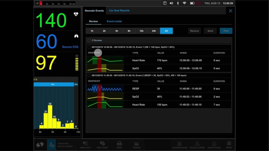
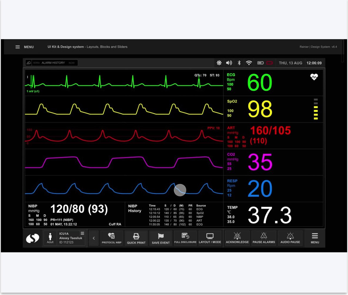
Patient monitor vital signs surveillance interface
Vital signs on the patient monitor: readable from across the room, with the alarm hierarchy the standards demand.
MethodsHE75:2009 · IEC 60601-1-8 · user interviews · usability testing · CJM · Lean UX · design system · distributed teams
Process

Three weeks onsite with clinicians before the design system existed.

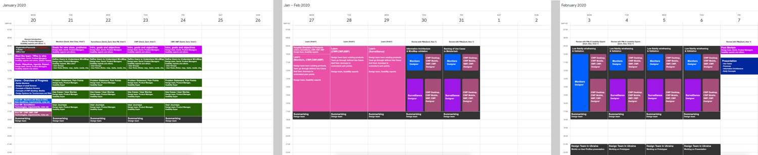
In January 2020 I led a six-person design team on a three-week onsite engagement at the client's site: kick-off sessions, use-case workshops, persona work on flipcharts, and hour-by-hour agendas with the people who build and use the monitors. The design system and every later screen grew out of those weeks.

Three-week onsite workshop calendar with colour-coded sessions
The three-week onsite plan: colour-coded kick-offs, use-case workshops and review sessions, day by day.
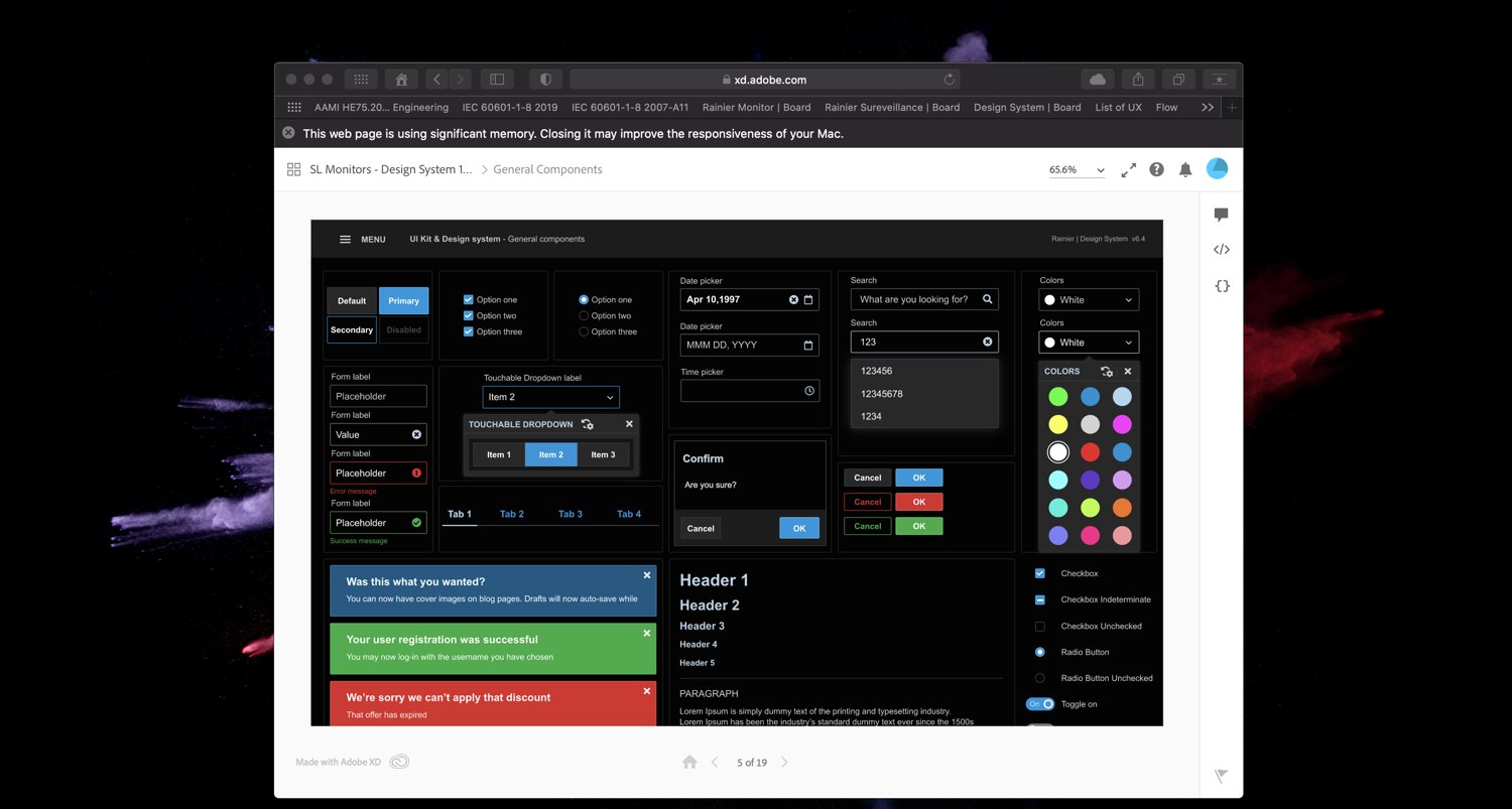
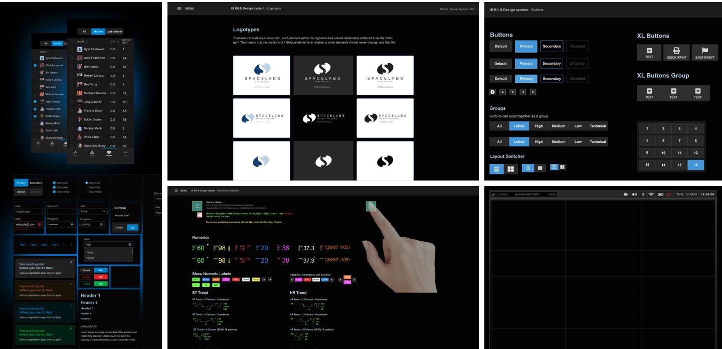
The medical design system components in the design tool
The design system in work: the dark medical UI kit (forms, dropdowns, alerts) that carried the standard across surveillance, portal and mobile.
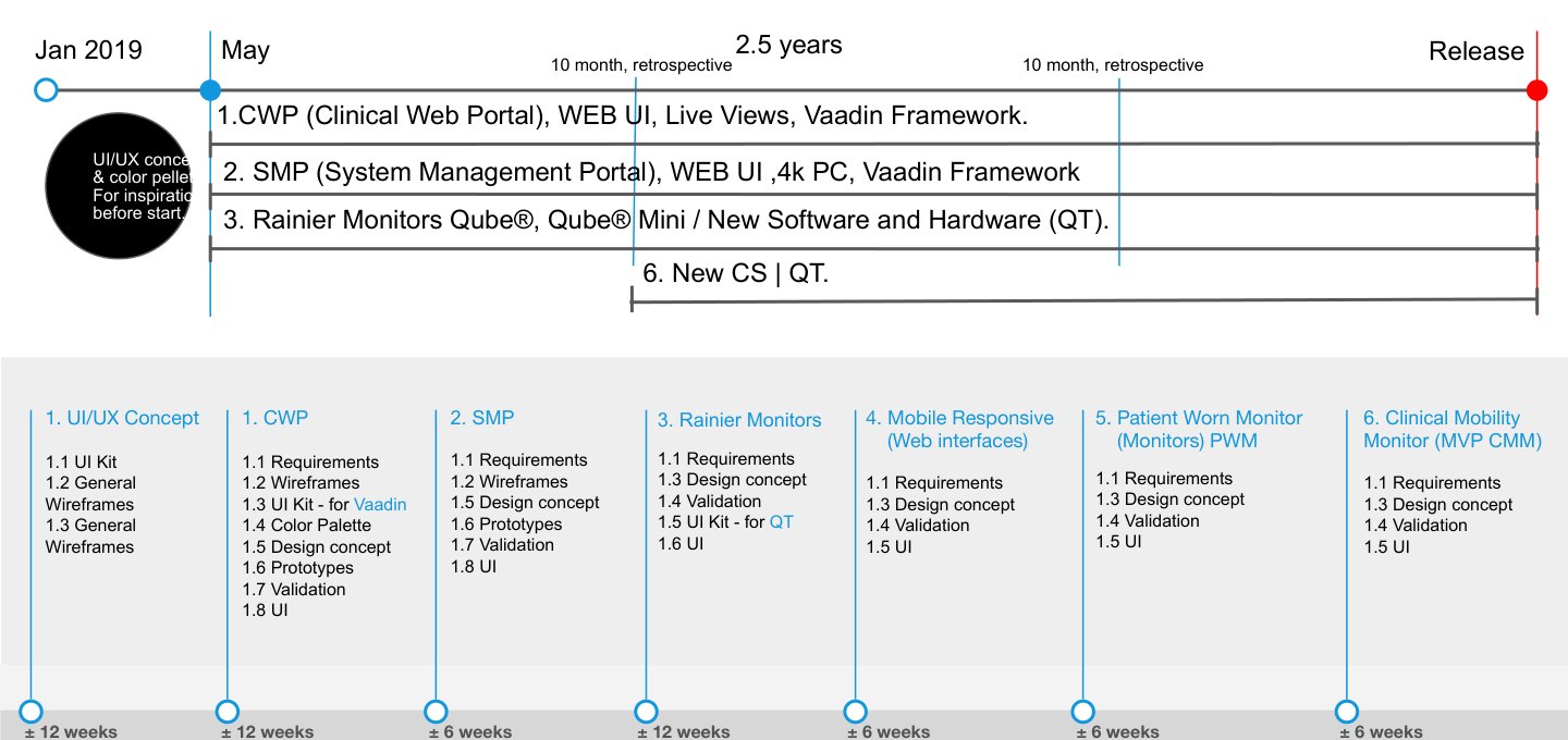
Initial milestones plan across the product family
The plan: initial milestones for the whole product family, scoped in 12-week increments. Requirements, concepts, design system, then product by product.
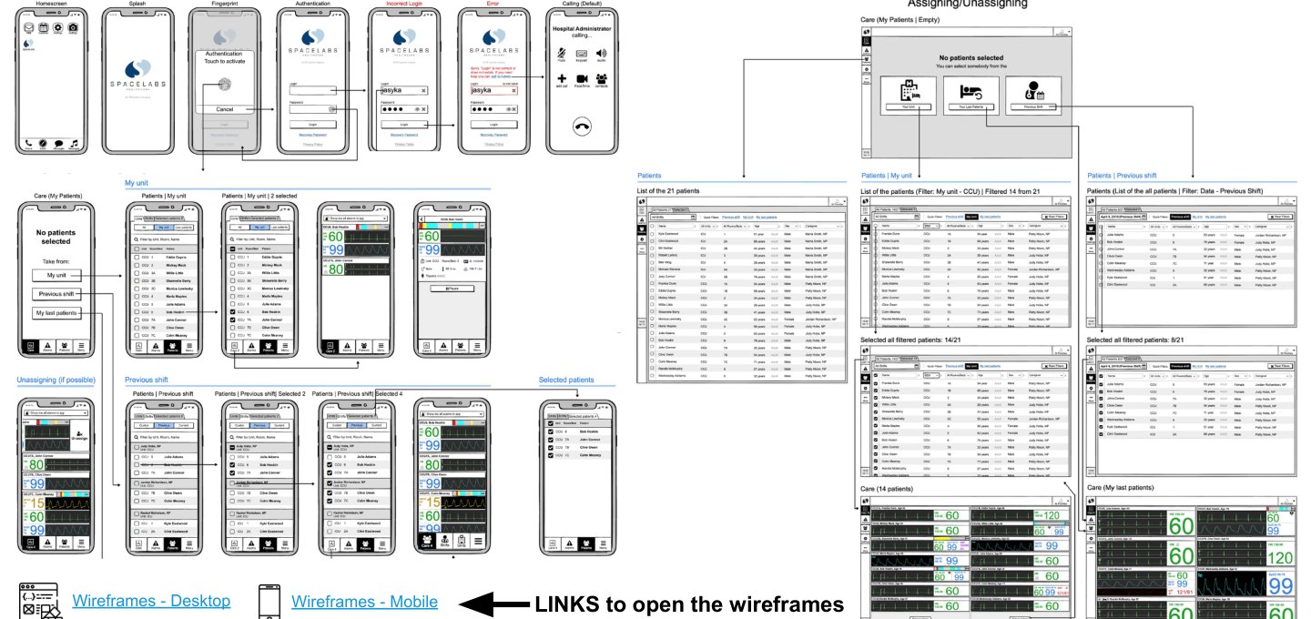
Clinical web portal wireframes and flows for desktop and mobile
The clinical web portal: wireframes and flows, desktop and mobile, linked so every screen opens its flow.
The design system for touchscreens
The design system for touchscreens: dark medical components built for gloved hands and bedside light conditions.
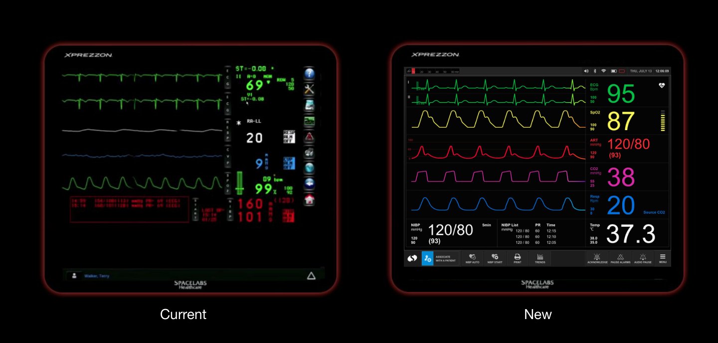
Comparison of the current monitor and the new concept
Current monitor against the new concept, side by side: the same vitals, readable from across the room.
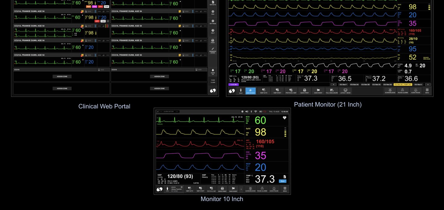
The product lineup: clinical web portal, large patient monitor, bedside monitor
One system across the lineup: the clinical web portal, the large patient monitor, and the bedside monitor.
Full case

The detailed story is shared on request.

Client names, process artifacts and outcomes stay within NDA. Ask, and I will walk you through the full case.

Get in touchRequest the case